The Michael Kors logo is instantly recognizable across the world. Whether stamped on a leather tote, engraved on a watch, or subtly placed on footwear, the brand’s logo has become a powerful symbol of modern luxury. But what makes the Michael Kors logo and branding so iconic? And why does it resonate with such a wide global audience?
In this in-depth guide, we’ll break down the meaning, design, and strategy behind Michael Kors branding, explaining how the logo builds trust, signals luxury, and influences buying decisions. This article is written to help fashion buyers, luxury enthusiasts, and resale shoppers understand the value behind the brand, not just the look.
Understanding the Michael Kors Brand Identity
Michael Kors is built on a clear lifestyle vision: jet-set sophistication that feels effortless and accessible. The brand doesn’t chase extreme fashion trends. Instead, it focuses on polished, wearable luxury that fits into everyday life.
Core Brand Values
Modern elegance
Practical luxury
Confidence and ease
Global, cosmopolitan style
The logo and branding reflect these values through simplicity, clarity, and consistency key traits of any iconic fashion identity.
The Evolution of the Michael Kors Logo
Unlike many luxury brands that constantly refresh their logos, Michael Kors has taken a minimal-evolution approach. This consistency has played a major role in making the logo timeless.
Early Logo Design
From the beginning, the Michael Kors logo used a clean, sans-serif typeface featuring the full designer name: MICHAEL KORS. This choice emphasized clarity, authority, and modernity rather than ornate design.
Why the Logo Hasn’t Changed Much
Builds long-term brand recognition
Signals stability and trust
Avoids trend-driven redesigns
This restraint has allowed the logo to age well and remain relevant across decades.
The Famous “MK” Monogram Explained
The MK monogram is one of the most recognizable elements of the Michael Kors brand. Often seen repeated across handbags, wallets, and accessories, the monogram serves both aesthetic and functional purposes.
What the MK Monogram Represents
Status without excess
Subtle confidence
A balance between luxury and everyday wear
Unlike logos that dominate a design, the MK monogram is usually integrated in a refined, repeat pattern, making it recognizable without feeling overpowering.
Typography: Why Simplicity Works
Typography is a cornerstone of Michael Kors branding. The brand consistently uses clean, modern fonts that communicate sophistication without distraction.
Why the Typeface Matters
Easy to read across all sizes
Works equally well on handbags, watches, and digital platforms
Feels modern yet timeless
This typographic consistency strengthens brand recall and reinforces a polished, professional image.
Color Palette: Neutral, Luxe, and Timeless
Michael Kors branding relies heavily on a neutral color palette, including black, white, gold, beige, brown, and soft metallics.
Why Neutral Branding Is Effective
Matches a wide range of outfits
Appeals across cultures and age groups
Supports long-term resale value
Gold accents, in particular, play a major role in reinforcing the brand’s luxury appeal without appearing flashy.
Logo Placement: Strategic and Intentional
One of the reasons the Michael Kors logo feels premium is how intentionally it’s placed. The brand understands that logo placement can either elevate or cheapen a product.
Common Logo Applications
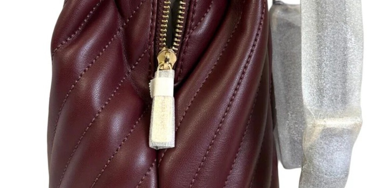
Metal logo plaques on handbags
Subtle embossing on leather
Engraved hardware on watches and belts
By avoiding oversized or chaotic branding, Michael Kors maintains a sense of refinement while still being easily recognizable.
Branding That Builds Trust and Recognition
Trust is a key factor in luxury purchasing decisions, especially for pre-owned and resale shoppers. A consistent logo helps buyers quickly identify authentic Michael Kors products.
How Branding Supports Buyer Confidence
Clear logo standards reduce counterfeits confusion
Familiar branding reassures quality expectations
Consistency across collections builds reliability
This is particularly important in online and resale markets, where visual cues heavily influence trust.
Michael Kors vs. Other Luxury Logos
Compared to ultra-luxury houses like Chanel or Louis Vuitton, Michael Kors branding feels more approachable and that’s intentional.
Key Differences
Less historical symbolism, more modern appeal
Cleaner logo without ornate motifs
Focus on lifestyle rather than exclusivity
This positioning makes Michael Kors appealing to a broader audience while still maintaining its luxury status.
Why the Logo Appeals to Global Audiences
Michael Kors branding works globally because it avoids cultural extremes. The logo is language-neutral, modern, and adaptable across regions.
Global Branding Advantages
Easy recognition across countries
Works in both Western and Asian markets
Aligns with travel and jet-set imagery
This universality has helped Michael Kors become one of the most recognizable fashion brands worldwide.
Branding and Resale Value
While Michael Kors is considered an accessible luxury, strong branding still plays a role in resale demand.
What Buyers Look For
Clear logo visibility
Classic monogram styles
Neutral colorways
Well-maintained monogram bags and classic logo pieces often retain better resale value than trend-driven designs.
How Branding Influences Buying Decisions
For many consumers, the Michael Kors logo represents a milestone purchase, a step into luxury without intimidation.
Why Shoppers Choose Michael Kors
Recognizable logo at an attainable price
Confidence in quality and design
Brand credibility built over decades
This emotional connection is a powerful driver behind the logo’s iconic status.
Final Thoughts: Why the Michael Kors Logo Is Truly Iconic
The Michael Kors logo isn’t iconic because it’s loud or complicated it’s iconic because it’s clear, consistent, and confident. Through thoughtful design, strategic placement, and a deep understanding of consumer psychology, the brand has created a logo that communicates luxury without excess.
In a world where trends come and go, Michael Kors branding stands out by staying true to its core identity. That timeless consistency is what makes the logo not just recognizable, but enduring.